Tips & tricks - Video-Capture: Drawing a 3D-Logo with photoshop
Before we start...
This tutorial is dangerous. It's an effective way to learn a great amount of what you technically can do with photoshop, but it's also a bad example for making the technology more important than the content. So don't look at the ugly image that is being created but try to understand the simple photoshop-basics and use it more wisely.Always remember: Understanding the tool is just the the first step. Doing something useful with it comes next (and is not covered by this tutorial.)
Tom, 11.3.2001
An ugly 3D-Logo in 18 minutes Photoshop
Fortunately I found a brilliant tool called Camtasia . With this you can capture videos from your computer-screen. So what could be a better tutorial than watching someone doing something, from beginning to the end? I tried to make the size of this videos as small as possible, but after all they are about 10 mb large.The following topics are covered:
- Working with paths (Part 1)
- Creating outlines
- How to Start
- How to correct
- How to add serifes and curves
- Transforming parts
- Converting paths into filled shapes
- Creating an easy 3D-Shape (Part2)
- Perspective
- Using layers (part 3)
- Lock Transparency
- Grouped-Layers
- Doing outlines and borders
- Using adjustment-layers
- glow-effects
- Using the Smudge-Tool
- Adding textures with overlay-layers
- Adding ugly lenseflares
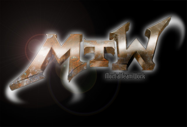
This is the poor result after 18 minutes technology-show...

Once again: Of course, this logo really hurts the eye. The typography is bad, the contrast and lighting is flat, there is no composition a.s.o. Today I would do this logo only with hard brushes, but I wanted to cover as much photoshop-magic as possible...
Additionally camtasia graps most of the computer's performance, so doing something nice in no time, using the slowest computer on earth in an rediculous low resultion is not the easiest thing.
Download the Videocaptures...
Here are the files you need...- mtw_schritt1_pfade.avi [760 kb]
- mtw_schritt2_3d.avi [4494 kb]
- mtw_schritt3_finish.avi [4748 kb]
- tscc.exe [190 kb]
Part 1 - Paths
This will show how you easily create clean typography using paths. |
As you can see, I only work with the standard-setting of the path-tool. |
 |
I switch to the other modes using CONTROL, ALT and SHIFT. For a complete description of the pentool have a look at the photosohp-manual "Drawing with the pen tool". |
 |
At first I hide all the tool-palletts with the TAB-Key. I don't need them, because I switch the tool with the hotkeys. |
 |
I enter the rough shapes of the font. (Click, Click, Click) |
 |
Always look at your mouse-pointer: there is a small circle below your pointer, if you're closing a path. Or there is a "+" or "-" if you are above a path, hinting that you can add or remove points below. |
 |
If you click on a path with CONTROL and ALT at once, the
complete
path is being selected. If you click on other paths while holding down CONTROL, SHIFT and ALT, they also become selected. |
 |
At 00:45 I select all three letters with ALT+SHIFT. |
 |
At 00:47 I press CONTROL+T for "Edit-Free Transform". The transform-box is displayed. |
 |
If you drag a corner of the transform-box with ALT+SHIFT you scale proportionally about its midpoint. |
 |
Frequently changing the mid-point (eg the rotation-center) can be very handy. |
 |
Use the right mouse-button to easily get other
transformations
(like mirror horizontally). And finish the transformation by hitting the ENTER-key. |
 |
At 00:53 I hit CONTROl-R to switch on the rulers because I want to drag in some guides. |
 |
At 01:01 I lock the guides to avoid accidental changes. |
 |
Now I am going the adjust the font's proportions. Therefore I constantly hold down CONTROL, for using the pen-tools move-mode. Always remember: You can drag lines too. |
 |
At 01:15 I start to add some serifes (pointed corners). Therefore I add some points to the lines and move them or the the endpoints of the lines. (this is a pretty effective way of adding curves.) |
 |
Near 01:18 I actually wanted to move the line. This didn't work because the the anchors of the line were in the way. So I move the points seperately. |
 |
At 01:59 I use the second possibility to create a rounding: Using the ALT-Key I switch to the "Convert-Point"-tool. When the mouse-pointer is above a point, it changes into an sharp open triangle: Click on a point, to change it into a sharp corner. Drag a point this way to creat a bow. |
 |
At 02:13 I select several points to transform them by holding down CONTROL+SHIFT. |
 |
At 03:05 I select select some points to adjust them with "Free Transform". This is quite effective. Additionally I hold down the ALT-Key to transform around the midpoint. |
 |
At 03:32 I copy the "M" by dragging it while holding down CONTROL+ALT. |
 |
CONTROL+T for "Free transform", right mouse-button, Rotate 180°. |
 |
At 04:32 I use the cursor-keys to exactly transform the "T". |
 |
That's it. Don't forget to save the path at the "Path"-Palette. Then contonue with part 2. |
Part 2 - Perspective and form
At this part I will use the created path to create a threedimensional logo. 3D-Renderingtools are not always the fastest way. This pixel-method is as old as computergraphic, but there might be some aspects, which are new for the beginner. |
I select the path in the path-palette. |
 |
At 00:20 I convert the path into a selection by holding down CONTROL and clicking on the path's thumbnail in the path-palette (Note the small rectangluar icon at the cursor, when holding CONTROL over something, of that you can get a selection from). Its nice, that photoshop is hiding the original path. |
  |
At 00:24 I create a new layer in which I want to fill with my selection. Normally I create new layers by CONTROL-SHIFT-N because this way I am forced to enter some name. For this tutorial, I will use the "New layer"-icon in the layer-palette, but I will click there with the ALT-Key so I can enter names immediately. Names are quite handy, but you will learn this later, after noticing what clicking with CONTROL and right mouse-button is good for... |
 |
At 00:37 I select a bright gray... |
 |
... which I use for filling at 00:45. (Normally I use ALT+BACKSPACE for filling.) |
 |
At 01:02 I perspectively transform the layer. I could also do this by draggin a corner while holding down CONTROL+ALT+SHIFT ;-) |
 |
At 01:15 I finish the transformation by pressing ENTER. |
 |
At 01:21 I create a
copy
of the "Oberflächen"-Layer by
dragging its thumbnail to the new-layer icon of the layer-palette.
("Oberfläche" is the German word for "surface"). An even faster way to copy a Layer is pressing CTRL+ALT+j. |
 |
Thereafter I drag the copy under the origianal layer. And rename it after double-clicking on its thumbnail. (With ps6 for renaming a layer you have to hold down ALT while double-clicking on it.) |
 |
At 01:51 I move the layer with the cursor-keys and
holding down CTRL. (Note: CTRL temporary changes to TRANSFROM-Tool from
any tool but the transfrom itself. Here pressing CTRL enables
"autoselect layer"). |
 |
At 01:56 I use "Image->Adjust->Levels" to darken the layer. |
 |
At 02:21 I slightly scale the layer (holding down SHIFT+ALT to keep position and proportion). |
 |
At 02:28 I beginn to complete the edge. Accidently I
had
the brushes opacity set to 64%. Using a large brush like this makes the
edges blurry. For really sharp edges use the lasso-tool or work with a huge resolution and scale down later. |
 |
At 03:34 I create a new layer which will contain the beveled edges. |
 |
To create the edges I get the selection from the layer by
CONTROL-clicking on its thumbnail. |
 |
Then I shrink the selection by 2
pixels (Selection - >Modify Selection -> Contract). |
  |
I invert the
selection (CONTROL-SHIFT-I) then holding ALT-CONTROL-SHIFT I click on
the "Oberflächen"-Thumbnail again. Note the "X"
under the mouse-pointer. There were many questions about this step. It's probably the most difficult in the whole tutorial. What happens is the following: The contracted and inverted selection holds the whole image but not the inner parts of the logo (in other words: the Background and the border of the logo). Getting a layer´s transparency-informationen by clicking with CTRL+ALT+SHIFT only selects areas, where this layer HAS FILLED PIXELS and THAT ALREADY WERE SELECTED. This results in a selection of the outer areas of the logo. |
 |
I hide the selection (CONTROL-H). |
 |
Then, using a large soft brush, I add some black and white strokes. |
 |
At 04:50 I discard the selection with CONTROL-D. Note
that hidden selection might sometimes be confusing. If you are not
sure, if a there currently is a selection, press CTRL+H a few times. |
 |
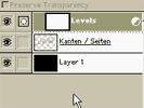
At 04:55 I check the "preserve transparency"-option for the "Kanten"-layer ("Kanten" means "Edges"). (The hotkey for switch this option is SHIFT-7 on the German Keyboard or "-" on an US keyboard layout) |
 |
At 05:00 I add some shadow with hard brush. |
 |
At 06:06 I switch to the "Oberflächen"-layer to add some shining edges. I CTRL+Click the layer-thumbnail to get its transparency. Than select a large soft brush, white color and low transparency. |
  |
At 06:54 I create an inner outline: I get the layer's
transparency as selection (CONTROL-Clicking), - contract the selection - create a new Layer called "Innere Kante" (inner outline) - chose Black as color - and use "Edit -> Stroke". |
 |
At 07:23 I reduce the opacity of the outline-layer... |
 |
This is the end of part2. |
Schritt 3 - Material und Effekte
It's a strange world: the ingridients that have the most impact are the easiest to achive. Sadly this lets many beginners forget that the to most important work is looking for an idea and finding a form for it. Adding the effects is just an add on. Working on the "look" without having an idea will not lead anywhere.Try to stay away from Filters. If you are using more than 10% of your time with Photoshop-filters you are definately on the wrong track. You should be very familiar with tools under "Layer->Adjust", esp. "Curves" and "Hue/Saturation". All these functions are also available as "Adjustment-Layers". Using "adjustment layers" is always a habbit.
You should also get used to the "layer-modes", esp. "Multiply", "Screen" and "Overlay".
  |
First we invert the background, so it gets pure black. |
 |
At 00:14 I combine
several layers of the logo and merge them into a new layer. This is
neccessary because of the grouped layer-effects I will use later. |
  |
At 00:17 to
increase the contrast of the logo I create a new
adjustment-layer by CTRL-clicking at the "New Layer"-Icon. (ATTENTION:
With Photoshop 6 comes a new Icon for creating adjustment-layers.)
|
  |
Additionally I set the "group
with layer"-option, since I want to
change only the logo. |
  |
Adjustment layers have the big advantage that the original pixel are not changed. I could change the level-settings later on or I could remove the effect without harming the original logo. |
 |
At 00:33 I create a
new
layer for the Glow-Effect. |
 |
At 00:38 I create a
selection from the logo (by clicking with CTRL into the thumbnail) and
fill the new layer with pure white. (Normally I would do this with
ATL+Backspace). |
 |
At 00:48 I use
Filter->gaußschen blur. Since the glow is not bright enough, I
duplicate the layer, reduce its opacity and merge it down by hitting
CTRL+E. |
 |
At 01:04 I create a
new
Layer for the logo's shadow. |
 |
With black color, a soft Brush and little opacity I add some
shadow. |
 |
At 01:28 I create a
new
layer for an outline. Then I get the logo's transparency and use
stroke/outside. |
 |
Starting at 01:56 I work at the glow-effect to show why layer-effects are not always the ideal solution. (Small tip: you can improve the performance of the smudge-tool by turning of "spacing" in the brush-settings.) |
 |
At 02:38 I drag and
drop
a texture into the file. |
  |
I group the texture-layer with the logo-layer by holding the
ALT-Key and clicking between the two layers. |
  |
At 02:46 I change
the
layer-mode to "Overlay". |
 |
At 02:56 I
perspectively
distort the texture. |
  |
At 03:04 I increase
the
constrast with the levels-tool. |
 |
At 03:21 I create a
new
layer for the lense-flare effect. This filter only works for layers
filled with dark colors. Therefore I fill with black and change the
layer-mode to "screen" at 03:44. This makes only the bright areas of the layer visible. Then I use "Filter->Render->Lense Flare" |
  |
To reduce the impact of the effect I reduce
its opacity and saturation. |
 |
At last I add some typo. |
In the end...
As I started to draw with computers I got an paint-program called "Animator". It was very complex and not very intuitive, but as a great feature it had some kind of VCR. There came a record with the program that explained most of its function and I watched it for a thousend times. A week later I knew most of the important features and could concentrate on "drawing with the computer" instead of "using it".Don't forget, that this logo is not a piece of art. Actually it's ugly. Don't copy it.
tom, 10.3.2001
english version, 2004-05-14