A suggested redesign for Maya's graphical user interface
Für diesen Text gibt es keine Deutsche Übersetzung.
by
Thomas Mann aka. pixtur.de
2004-01-30
Updated 2004-05-13
updated 2004-06-29
About this paper
During
a recent large scale project for a car manufacturer, came in contact
with Maya, a high-end tool for 3D-visualization. Although I really
love the handling of Maya, most of its 3D-modeling tools and the
over-all
concept of the interface, I think there are some serious issues within
the design of the interface.
I started this redesign mostly for fun. I am very interested in
interface-design and therefore Maya is quiet a good subject of
studying. I don't think that there is anybody outside, who really knows
anything about this tool (excepting its programmers at Alias and maybe
gmask and some other people at highend3d.com). I read five or so books
and talked to a lot with other users of maya. |
I also have
got
experience
with some other 3D-programmes like 3dsMax, AutoCad,
Medit, Microstation, Form-Z, Lightscape
(not
really a modeling tool), Poser
(too) and Multigen Creator.
Maya has a better interface than
any of
these tools (excepting some aspects of Multigen) but it's definitely
not perfect. If you look at certain aspects of Poser or Softimage
it is
really obvious that there is is a huge potential of improvement.
I think that one of my favourite programmes should not only create
amazingly
good pictures. I also want it to look amazingly good, while I am
working with it. |
After I posted the first version
of my suggestions under highend3d.com
there were a lot of argument about colors and fency interfaces vs.
workflow. I really learned in this thread and redid most of my design.
|
Thanks for ideas and feedback:
M. Elsässer, N. Mühr, C.Mantei, I. Radusch, A. Baslik, O.
Markowski, Joojaa, beaker, askaniblue, STZ, a.m.o.
|
Over-all ideas
- Save screen-space AND increase clarity! (There are
NO
changes that need more space than before).
- Speed-up handling and workflow! I tried to show
intuitive short-cuts whereever possible. Some could be tremendously
helpful.
- Be intuitive! If complex things can be shown
understandable without confusing advanced users, make the beginner's
life easier.
- Do not distract from work. The interface should
follow
common standards. There is no need to reinvent the wheel. I did not
want to turn Maya into Poser.
- Save resources! Avoid fancy effects (soft-shadows,
blending, scaling etc. of interface-elements) and useless
programming-effort.
- Make the interface say as much as possible - even
anything if necessary. The shading-networks are a good
example for what's wrong with the interface. If printed in manuals or
tutorials they need
some extra pages of text to explain what's going on.
- Least important: Do a cosmetic face-lift without
confusing/limiting advanced users. Borders and separation-lines tend to
clutter the
interface and steal rare desktop-space from the really important
elements. They should avoided where ever possible.
|
|
Maya's current interface
What is good...
- The current interface is highly portable to new
operating-systems
like macOS or linux (on which I worked on).
- The defined set of controls (like Buttons, Groups, Sliders,
etc.)
allows easy usage with MEL-Scripts or plug-ins. Which doesn't not mean
that this defined set of controles could not look better.
- The combination of operating-system-based controls (like
Buttons
in Attribute-Editor) and open-gl accelerated views (like Graph
or Hypershade) without any fancy drawing-overwrites, bit-maps
or
alpha-shadows renders fast and consumes less memory. It's also
scaleable to different display-resolutions (you can enlarge the graph
of a shading-network for optimized display at really high resolution,
where you could not read the tiny fonts of fixed text-sizes.)
- The usage of operation-system-settings usaually fits the
users
habbits: a
MacOS-User is not confused with another look of buttons or TAB-Controls.
- Fonts drawn by the operation-system are
resolution-independant and can use effects like "cleartype".
|
...and what could be better
- The handling not as intuitive as possible (see examples
below).
- The interface tends to consume more screen-space than
actually
necessary.
- Sometimes the interface's clarity suffers from too many
lines and
borders.
- This software looks what some would call "old-school". It's
not
"ugly" but its
like "We only care about how the interfaces works. Not how it looks."
(Some might consider this as an advantage.)
- Parts of the interface do not look finished at all: E.g.
sorting
Materials
in Hypershade or Multilister does not work well for
large projects.
- The navigation is not always constent (sometimes you
can't zoom/pan with ALT+MMB).
- Maya´s interactive configuration of window-layouts is
weak compared to newer concepts like qt. See
Tab-Concept below.
|
Paintovers
The original maya screen.
Click
to enlarge.
|
My redesign started with a
paintover of a pretty scattered but
nevertheless typical maya-desktop. Since I
wanted my job not to
be too easy, I reduced the screen-resolution to 1200x900. |
The overpainted maya screen.
Click
to enlarge.
|
This is the 8th version of the paintover. I more
or leass though about every interactive element and if it might be
improved.
The imported changes are probably:
- a new look for controls (entry-fields, controls,
drop-downlists)
- Replacing the channelbox with a dynamic sidebar.
- Tabs to easily configure screen-layout.
- A new look for the hypershade.
But there are a lot of minor detail-changes, which are described
further below.
|
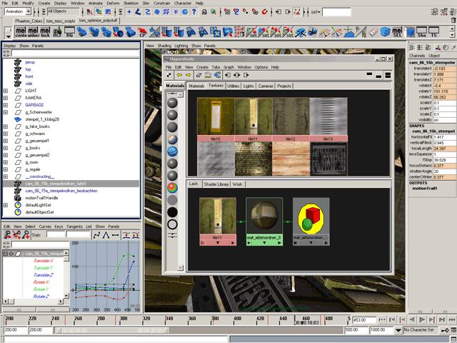
A suggested screen-layout using a narrow Attribute Editor.
Click
to enlarge.
|
I was really interrested in how maya elements
could be squeezed to optimize usage of screen-space.
I squeezed the attribute editor's width from 461 pixel with
to 261 pixels. Since everything relies on dragable tabs, there could be
two attribute-editors beside (showing different nodes or different
attribute groups).
|

A suggested screen-layout using a narrow Chanelbox / Sidebar.
Click
to enlarge.
|
|

A suggested screen-layout for material tuning and rendering.
Click
to enlarge.
|
|
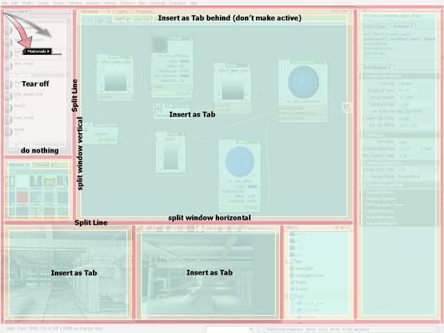
Possibilities for dragging a window.
|
The suggested design relies on windows that can
be docked or stacked as tabs.
E.g: You could drag the handle of the material-tab to:
- tear it off
- insert the window as a new tab into another window
- create a new window by splitting a line.
- create a new window by splitting an existing window at one
of its sides.
|
Timeline
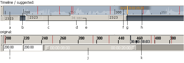 |
I overpainted the Time-Line
and especially tried
to make it readable even with lots of information in it (Keyframes,
Frame-Numbers, Time-Code, Audio-Level, Working Area etc.)
|
- take "time-background-color" from graph-window
- slightly shaded audio-level
- distinguish between primary and secondary scale
- add drag-handle
- use space for additional information
- show both Frame and Timecode
- clearly show current time-position (the inside gets red if
exactly on a keyframe)
- shade background
- odd vertical alignment
- could probably be more intuitive
- hardly readable
|

|
While playing around with
the timeline
I've got another idea:
Why not add some graphs to make scaling and timing of keyframes easier?
- Clicking and dragging LMB would slide through time, just
like in the timeline.
- The small keyframe-markers could directly be moved
left/right with MMB.
- Several keyframe-markers could be selected and moved /
scaled like in Adobe After-Effects.
- To make them always visible, each graph should be scaled
independently. This view is for tuning timing not values.
|
- A neutral background-color might be more appropriate.
- shade the background to make current Timecode always
visible.
- Show both: Frame and timecode.
- Mark the possition of eath keyframe.
- highlight important times.
- Don't hide time-ticks with keyframe-markers.
- slightly show audio-lever.
- Start of the selected time-range (I don't know, if this is
clever)
- Scale handle
- Color the affected keyframes.
- Drag handle
- Toggle between minigraph and timeline / range-slider.
- Show both: Timecode and Frame (not sure, if this makes
sense.)
|
Commandline
 |
| The combination of Command-line/
Script-line
and Help-Line is not very practical. Most of the time you
only need one if it. Since work-space is limited, I normally turn off
the help-line
and sacrifice the Status-/Progress-Bar (which would be very
useful for
long operations) and the number-feedback of dragging-manipulation.
I suggest assembling all three in the same line and
make them dynamically scaling in width. |
- adaptive help-line / coordinate-display / progressbar
- adjust size
- The passive command-line is quite small. If it
gets
focus it
gets wider - squeezing the now less important output-line. A
down-arrow
makes lastcommands accessible.
- command-line history
- output-message
- I slightly adjusted icon for script-editor.
|
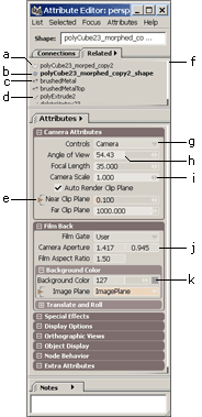
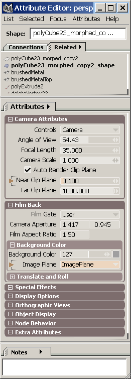
Attribute-Editor
Maya's attribute-editor tabs
are strange in some ways:
For shapes they form some kind of "meta-group" of nodes related to the
shape: The transform-node, the shape itself, the
first assigned material-node and the nodes of the
construction-history. If you change the selection to another shape, the
currently tab-type stays the same: You can easily compare or change the
material- or transform-setting of different shapes. That's cool.
Not so cool are the following
trade-offs:
1st: Putting an unlimited number of probably long node-names in
one
horizontal list is not very handly: You can only read a fragtion of the
list or
the list gets very broad. Maya perfectly combines both of this.
2nd: Maya does strongly filter the shown nodes. That leads to the
effect that an incoming connection like an polyExtrudeNode might be
shown in the shape, but the shape is not shown in the polyExtrudeNode.
Filtering the connection in that way makes it really hard to see,
what's going on. A perfect example for this problem is browsing
shading-networks: In the Attribute Editor of a layeredShader
you clearly see that an attribute is connected to another node. If you
follow this connection, you can see it. But there is no way back!
A solution for both problems could be the usage of several tabs. One
for input- and output connections (browsing the network). One for the
related "meta-group" that can be shown above the tab of the current
node. |

The original "Attribute Editor".
Click
to enlarge.
|
Attribute Editor - Suggested

Suggested Redesign.
Click to enlarge.
|
- Type and Name of current node.
- The suggested design strongly relys on groupable tabs (see
detailed description above).
- The "upper" border of the scroll-bar.
- List of important incomming connections.
- Symbol stands for the current node.
- "Bottom" of the scrollbar.
- I made the border a little bit less dominant.
- We are reading from left to right. Therefore, an "Incoming
Connections" should be shown on the left side of the area.
Maya´s placement on the right side suggests that the value is
used somewhere else.
- Some icon to expand a color to its RGB-Components. The icon
is
only shown in mouse-over.
- In complex shader-networks the "number-value" is often more
important, than the color-field.
- Outer Border of the Film-Back-Box.
- The Value of the inner box is slightly shaded to emphasize
the
hierarchical grouping.
- If several shaded groups are placed below each other
reducing
their separation can greatly increase clarity and save some
screen-space.
- Using the already etablished tab-grab-handle, suggest that
the
"Notes" can be hidden.
- Since the name of the current node is very important, this
field
should be as broad as possible.
- If there is nothing to scroll don't display scrollbar.
- I removed some border-lines to reduce cluttering.
- Distinguish different sliders: The open end suggests, that
the
value could be further increased.
- Tiny number of the max-value gives the slider a dimension.
- Distinguish different sliders: Snap-handles for
integer-values.
- If the values is controlled by an incomming connection, we
don't
need a slider-handle.
- Create Connection-Icon. (only shown if mouse is
over
attribute.)
- Change value-icon (only shown if mouse is over
attribute). On mouse down an intuitive marking-menu pops up: (advanced
marking menu of
value-change)
- Change Hue/Saturation-Icon. (only shown if mouse
is over
attribute.)
- Handle of show that window can resized.
- Opened nodes should get enogh space to there neighbours.
|
Attribute Editor - narrow to replace the Channelbox...
Attribute Editor - Narrow
Click
to enlarge.
|
- List of related notes displayed vertically.Tiny Icons help
to distinguis node-types (Transforms, Shapes, Materials, Modifiers,
etc.)
- The current node in bold type
- Since there might be more than one material assigned to a
shape, the attribute editor should list all of them.
- Modifies (similar to channelbox)
- This attribute in controlled by an input-connection. (The
value is shown in orange)
- This list should be scrollable with ALT+MMB.
- I reduced the contrast of the drop-down control to
emphasise the value. This has trade-offs since it could be mistaken for
a disabled state.
- At highend3d.com beaker suggests a
combination of value and virtual
slider, which he has seen in shake. I think it really could
work and save a lot of space.
- Make virtual sliders obvious.
- Removed space between multiple fields.
- Color-field should be drag-able with MMB (a temporary
pop-up with a color-field could be displayed, that is closed after MMB
release.
|
Shelf-tabs / Statusbar
|
Statusbar & Shelf - original.
Click
to enlarge.
|
For most users new to maya the
combination of Main-Menu, Statusbar and Shelfs/Shelftabs
is overwhelming
and
confusing. I think
that a little bit less of controls would increase the usability. Some
order is needed to lead the eye and group the elements where they
belong.
Shelfgroups:
More than one shelf-Tab can be
visible
at the
same time. I noticed that many users switch shelf-tabs quiet often just
to
look for a certain shelf-icon, e.g. between a shelf with common tools
and
another one with own scripts. Splitting the shelfs to "shelf-groups"
allows grouping the most important function at one shelf and putting
the more specific mel-scripts into other tabs. Dragging shelfs:
Splitting the Shelfs is
done by dragging a shelf-tab to the far right or far left of the
shelf-tabs or between "shelf-groups".
Dragging a shelf-tab out-side
the shelf-area makes it invisible
(but
does not delete it). This make the waste-basket-icon obsolete. I am not
sure, if dragging should be available with MMB only. Since the shelfs
are some kind of controls LMB-dragging would also be valid. Dragging
the separator between the "shelf-groups" to adjust the layout.
Small "drag-handles" make this feature intuitive. |
- Moved options and Shelflist to far right (k and L)
- The "mel-Item" is replaced by a smaller one.
- The
Font-Size of the Mel-Item-Description was reduced and set to normal
font-weight. I consider descriptive Icon-Names more important than easy
to read letters of cryptic shortcuts. For all elements with limited
width (like boxes in hypershader) or Material-Names, etc. a narrow font
is suggested (Tahoma or Arial instead of Verdana). Maybe even Adobe`s
small-fonts that come with Photoshop.
- Shaded passive tabs to enhande claraty
- "Grab-Handle" for the active tab.
- If not all items fit into a shelf a "wipe"
replaces the "scrollbar" (which was actually not noticeably as such
one). Clicking the arrows scrolls full rows of Shelfs-Items, showing
the row in the middle. (A real scrolling up and down within about 4-6
frames would help to visualize this concept.)
- number current row
- separator between shelf-tab-groups (drag
left/right to
adjust
size)
- adjusted background-color of active icons
- I moved the Shelf-Options
and Shelf-Set-Icons to the far
right. Here is enough space to write
out their function and also to add icons for other tools ("new shelf",
"trashbin"). (Negative: This placement makes them not available, when
"Shelf-Tabs" are not shown. There also might occur some problems when
too many tabs exists.)
- writing out makes it clearer
- Trashcan (probably no longer needed)
- I would add toolbar-function to the shelfs. The
Toolbar you easily be visible and customize-able without wasting 50
Pixels on the left border. (I turned the tool-bar off, but I sometimes
miss the "Last Tool Icon" to access the tool-settings.) Pracitally, the
shelf and the toolbar are the same. I would also suggest, to make the
shelftabs dockable to the left border of the screen.
|
|
The
placement of all items is done over
middle-mouse-button drag:
- Shelf-Icons from one Shelf to the
other.
- shelfs-tabs to another shelf-tab-group.
- a
shelf-tab out of the shelf to hide it.
- an Icon between two
shelfs or at the far right or left creates a new shelf
- a.s.o.
|
|
Example for dragging the Shelf "Conversion".
- creates a new shelf-group.
- changes the order.
|
Channel/Layer-Window
as sidebar
Maya´s current usage of
the sidebar is poor compared
to Adobe Photoshop, InDesign3 or Macromedia
Flash. It's only possible content are the channel-window
and
the layer-list. I could think of unlimited other
sidebar-windows:
Bookmarks, Materialpalettes, Custom-Controls for Plug-Ins,
Tool-settings etc.
|
Sidebar-Windows should be:
- "shade"-able (shrink to the title only)
- sticky
- changed in order and height
- easily controlled by mel-commands
|
At first I thought that it would
be hard to make the channel-box look
worse. But after spending some time I
realized, that there is a lot of information assembled here, and
visualizing the correct dependancies is everything but easy.
Here are two versions: |
|
Channel-Window

Channelbox - Original vs. refined
|
- I know, what these tools do, but not what the icons are
meant to
tell me.
- The handling of the "object"-list seems a little bit akward
(not
only because it's popping up on a wrong position -> screenshot).
A title like
"34 Objects" would make its purpose perfeclty clear.
- This does not look like a headline but like an editable
node-name.
- Maybe add some tool-icons here (similar to Photoshop
palettes)
- Displaying the attributes of the "polyExtrude"-Node below
the
"polyCube"-Node is confusing.
- Did anyone ever looked at these attribute? And to modify
the
"Offset"-attibute which is not accessible by the gizmo you have to
scroll down.
- Swap between "Side Window" and "Attribute
Editor"
- The "Channels"-Menu is also used as Window-Title. Clicking
on
"Channels" shades the Pannel. Clicking on the Arrow opens the
Context-Menu ("Key all", etc.). Dragging the grip moves the pannel
(e.g. below the Layer-List).
- This might be more understandably than the "object"-menu
(but I
am not sure.)
- Mini-Icons (Transform, Shape, Modify-Node, etc.) would
probably
help beginners. (But also decreases space for Node-Name. This should be
customizable)
- Clicking right should not only give access to functions
like "Key
all",
but also to "Clear Construction-History".
- Group related attributs
- In the action of work I sometimes change scale-values
instead of rotations. Not sure, if this helps or distracts.
- Headline for the following shapes
- reduce number of options
- In default only the most important or changed nodes are
visible.
The others can be shown be clicking "more...".
- Context-Menu für "Side Window". (List of possible Side
Windows; display options, etc.)
- Drag handle to change position inside the side-window.
Dragging it out of the "side window" hides.
- All of the 23 selected object has tx=0...
- ... but only the first has ty=1.988.
|
Layer-List
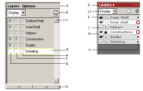
Layerlist - original vs. refined
|
- "Options" could be move to the "Layers"-menu
- The "New"-Icon is not understandable. If there is a
new-icon,
there should also be a "remove"-icon. (Which would make the
meaning of both icons obvious).
- Scroll-Bar should be hidden, if not necessary (just like in
Channel-window)
- Is there something like a "current layer"? Is is really
important?
- Not clear
- Reducing borders and 3d-edges would make the content
more prominent.
- Not clear
- The "Layer"-Menu also functions as window-title.
- Drop-Downlist made smaller. Maybe hide under options.
- New/ Remove-Icons
- Icon instead of "V"
- Shading the icons still shows the purpose of the column.
- Layers, that contain currently selected nodes are
hilighted. The
color-box on the right side gets bigger. Dragging the color-box into
another layer moves the selected nodes to this layer. (like Adobe
Illustrator)
- The color-Box.
- The screen-usage can be optimized by reducing the
spacing between lines.
|
Transform-Window
Maya's
main-purpose for organic modeling is
obvious. But it also could be used for precise polygon-modeling (e.g.
for architectural purposes).
What is missing are some things like:
- A more prominent numerical input that also works in
object-coordinate space. (Selecting one handle of the transform-widget
and and entering the distance for transform)
- A handling of local coordinate-systems: If several objects
are
combined or
merged with boolean operations the
object-coordinate-system gets lost: Imaging the facade-elements of a
house (doors,
windows, etc.) that´s slightly rotated about the
y-axis. If you want to broaden(?) a window for a precise distance and
you already merged some elements, you are lost. (I wrote some
mel-scripts to negative rotate and freeze transformations to handle
such situations. But that´s an ugly work-around.
- A precise slicing tool. Snapping constructions-plains to
elements
like faces, edge or three vertices. (I wrote some MEL-Scripts for this,
too.)
- Fixing the usage of some tools (esp. PolyBevel and Boolean
Operations) would be a good idea.
|
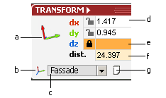 |
- The coordinate system of the current view could be shown
here
using the
appropriate colors for the x, y, z - values.
- List of user-defined coordinate spaces and "World",
"Object", "Normal" and "Local".
- current system
- This are the values for the current transform-operation.
- Axis can be locked, e.g. if you snap-move a painting on a
wall
(one axis locked) or all vertices on the floor to precisely the same
height (x and z would be locked for each vertex)
- Entering distances would use the current axis of the
transform-gizmo OR the direction of the last transformation.
- Small Icon for saving the current coordinate system (e.g.
Converting a "normal"-space to a user-defined cs). This should be done
over a small "new user-coordinate-system" dialog, which would not only
ask for a name, but also for other settings. There might be another
icon which would change the object-space of the currently selected
shapes to the current coordiate-system.
|
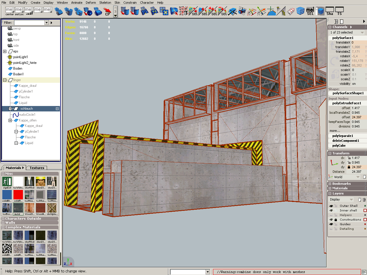
Outliner refined
| I first tried to reduce
font-size and spacing to increase the
outliner's information-density. But after a few tests I came to the
conclusion, that the outliner's font-size is just perfect.
Nethertheless I would suggest some other changes: |
|
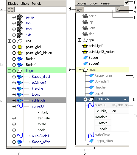
Outliner - original vs. suggested.
|
- The function of the filter is hard to guess, not only
because the
icons is misleading, but also because filter is case sensitive and
exact. (I would suggest an option for precise search.)
- Splitting the hierachy-lines and the plus-symbols to
expand/collapes wastes time
- The colors of the currently selected node makes the text
hard to
read.
- I tried a new filter-icon. Writing out "Filter:" might be
even
better.
- Combining Collapes/Expand-icons and hierarchy-lines.
Arranging
the icon left
of the node-name.
- Fast pannel-type-change (outliner, graph-editor,etc.)
- Some space left. Could be used for a "precise" option
(Non-Case-sentive and *text*)
- Drop-Down-List for last filters
- Filtertext is normally not longer than this.
- Hidden nodes are written in gray. (Blue and Black are
hardly to
distinguish)
- Inverted currently selected node and the "Show
Attributes"-Arrow
- Showing attributes. "Keyable" as default. Other
possibilties:
"Keyed", "Changed", "All", "Important"
- If there is enough space, why not show the current values?
- 84 pixels needed for hierachy-function...
- ...squeezed to 64 pixels without much loss of
information/readabilty.
- A customizeable column-view would also come in very handy.
Thinks
to display here could be total number of subnodes, the number of
overall triangles or comments. Adding comments (like: "Not not delete
this.", "maybe obsolete", "Still to do" etc.) could really speed up
working in teams.
Another issue is Hiding and
displaying selected elements: (My favourite method comes from Multigen:
Press
CTRL-H to hide a visible node (and all of its children). Press CTRL+H
again to
show the hidden node and any of the children. Selecting the Master-Node
and
pressing CTRL-H twice displays anything again. Very efficient (see
mel-source-code). |
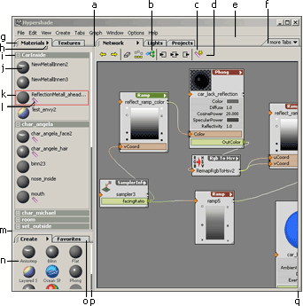
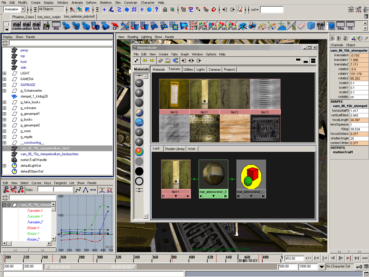
Hypershade
Hypershade, original
screenshot
My disappointment with the Hypershade
was the reason why I
wrote this text. The paintover
came
first, but during the last project, I was so upset about the
hypershade, I got enough motivation to writes some words about it.
Some problems...
- Looking for a certain material in an
alpha-numerical sorted list with a variable column-width isn't easy.
(Using a
case-sensitive sort-function makes this even worse.)
- Zooming in and out
just to read the names.
- The Multilister could be intergrated into the
hypershader.
- For large projects I missed a way to hierarchicaly
sort materials and distinguish between the "output material" of a
shading network (connected to a ShadingGroup) and other nodes.
- Since the borders of nodes in the material-list are thin
and
overlapping, it's sometimes not easy to tell wether a node is selected
or not.
|
|
"Hypershade" - original.
Click
to enlarge. |
- Most of this icons belong to the hypergraph (the lower
black
area) not to
the window.
- Clarity suffers from too many lines/borders.
- If this node would be selected, you probably would not see
it.
- The Material-Type-icons are hard to distinguish
and
contain no
transparency-information.
- I don't like this scrollbar. Why can't I scroll with
ALT-MMB?.
- This type of group-hiding is for experts only. I still have
to
open and close all hidden groups to find the right one. Besides,
headlines would help to clear the purpose of each icon.
- Too many lines/borders.
- For suggestions about shading-networks see below.
- The sphere are not always the best view for a material.
- This text is barely readable.
|
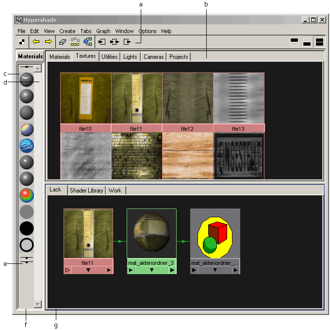
"Hypershade" - suggestion.
Click
to enlarge. |
- Separation-Lines between tabs (still not optimal).
Dragging would
change size.
- Tried to improve the "materials from shape"-icon.
- New icon for "Keep Bookmark for current Material shading
network". After
clicking, a bookmark-sign appears near the material (see m)
- Moved tool-icons from window-context to "Network"-Tab.
- Made line a little bit less dominant.
- Dragging a Tab out of the window would hide (but
not
delete it).
Hidden Tabs could be made visible here. Distinguish between different
types of tabs: Lists (like materials, textures, lights, etc. can be
changed in order), "Fixed lists" (like create-templates), user defined
lists (like favorites).
- Open Tabs have a draggin-handle. Dragging would also
rearrange
or hide tabs. Dragging a tab (e.g. "Materials") to the window-borders
or
at Separation-Lines between tab-groups (like
between
"Materials&Textures" and "Create&Favorites") creates a
new tab-group.
- The context-menu for Materials. Should contain functions
for the
display-type
(Text only, Thumbnails only, Thumbnails+Names or Detailed list) and
other settings for display (use checkerboard backgournd, use black
background use sphere/cube/cylinder, etc.)
- User-defined Material-groups would strongly enhance working
on
large projects. These groups should be arrangable in order (by
dragging) or grouping.
- Detailed lists should be zoom- and scrollable (up and down
only)
with ALT+MMB, ALT+SHFT+MMB. The thumbnails should be rerendered on the
fly. (Like already the case with material-icons).
- Clearly hilight the currently selected materials.
- This icon shows that a arranged shading-network
(graph-bookmark)
exists for this material. Clicking this icon should show this bookmark
in Network-Area.
- Separation-Lines between-Tabgroups.
- Listtype "Thumbnails with names". This should be zoomable
with
ALT+SHIFT+MMB and scrollable (up and down only) with ALT+MMB.
Icons
should be rerendered one the fly.
- Material-Types can also be dragged to another list
("Favorites"). Most users only need less than 10% of all available
material-types.
- A "3dmax-like" scrollbar would save desktop-space. A huge
scrollbar is not needed, if the user scrolls with ALT+MMB. Which
scrollbars are used (classing, small, none) should be configured under
preferences.
- A window that can be changed in size should make this
obvious.
|
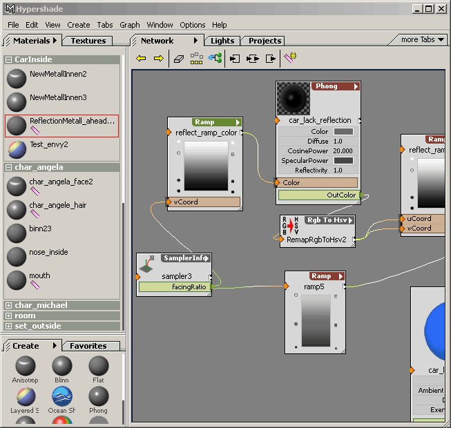
Shading Networks
Refined
Sample Shading
Network 1 (originial)
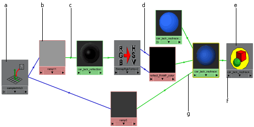
Sampe Shading Network.
Click
to enlarge.
|
- Text on colored background is hard to read.
- ramps and file-textures are not distinguish-able
- This arrows are too small.
- The entry-point of the incomming-connections are random.
- If open-gl-icons are used, at least make them look a little
bit
professional.
- Clicking to menu has the same effect as clicking with RMB.
- The connection-lines are not optimal and often don't
help to clear the purpose of each node. (Which node is for
transparance, which one for color, etc.): If you have something like a "layered
shader" you
can't tell the layer (input-number) and purpose (color or alpha) of the
incoming connections.
|
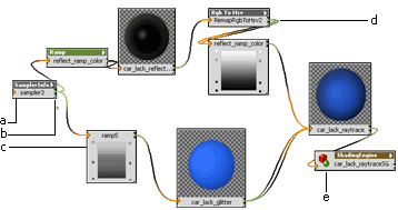
Customizing
hypershade-display
My initial idea for the hypergraph-view was the ability to customize
the display of each node type. The default-view would look pretty much
like maya's classic hypergraphs. But if a user wants to see the ramp
instead of the current render-buffer, he could right-click on the node
and change the display either of this singe node or the default
display-style for all ramp-nodes. I personally think, that most of the
node-types require different display-styles:
- The shader-node could be smaller
- for the layered-shader, the order of the incomming-connects
are important
- for a ramp-node you could add a small edit-control
For large projects or example-shaders could also show a small comment
field like ("Never change this" or "valid opacity from 0.3 to 0.5")
|
Context-menu for customizing node display. |
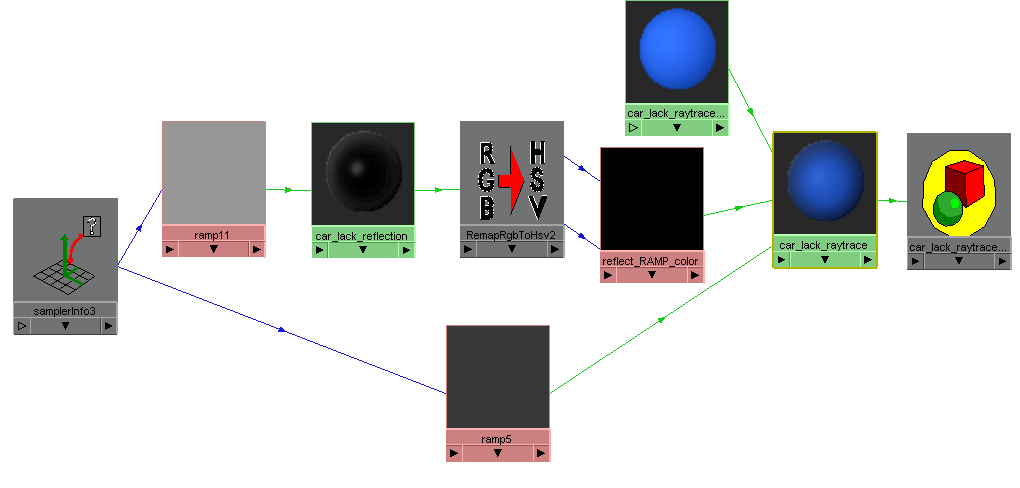
Same Shading Network
(full detail-view)

The sample-network in a detailed display.
Click
to enlarge. |
- All connected or changed attributes are displayed: Printing
this
graph would be enough to completely rebuild it.
- The common input and output-icons are shown left and right
of the
node-name. They are used just like in maya. If connected attributes are
not displayed, incomming connection-lines feed in here.
- All node-types are shown.
- Context-Menu for each node has a new sub-menu for
node-display-options. (see below)
- see b
- Connected attributes are shown shaded.
- Displayed attributes can be changed without the
attribute-editor
(e.g. be dragging with SHIFT+MMB) or clicking on the values.
- Hidden output connections.
- Displaying the ramp instead to the material-thumbnail.
Editing
the ramp works exactly as in attribute-editor. The values can be
changed by dragging handles with SHIFT+MMB or clicking with SHIFT+LMB
(Color-picker).
- Connection-lines are displayed as curves and slighly shaded
at
the ends. (The Curve-mode should be optional, since not all users do
like this.)
- Some thumbnails are shown in hires. The size of the
thumbnail can
be changed by enlarging the node-box. This might be more efficient than
zoom in a scaling the complete graph (even the utility-nodes). Of
course this does not mean,
that zooming is not needed at all.
|
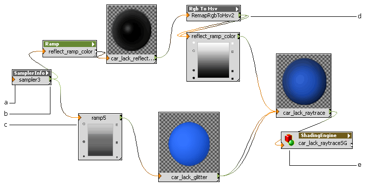
Same shading-network
with minimal display (showing
some
problems)
Sample-network in normal display.
Click
to enlarge.
|
Trade-offs:
- Vertically aligning node-name to in/out-connectors looks
odd.
- The resize-handle and the out-connecter are placed too
close to
each other. This would definately be a problem.
- Placing operational thumbs (ramps or curvers that can be
directly
manipulated in hypergraph) below node-name somehow looks wrong.
- Visualizing several connections between nodes is not easy,
if
their ends meet in the same point.
- I am very uncertain, if and when the use icons is a good
idea. If
they are placed left to the node-name, they cost too much space. If
they are placed above they look too dominant.
|
Conclusion
I really learned a lot during this experiment.
Not only about interface design, but also why certain maya-things are
the way they are. (Although this is probably not the easiest way of
learning advanced maya-features).
I am aware that this could never be a final design of a future version
of
maya: There are still too many inconsistent elements (like the
tabbed windows) and things that should have to be evaluated in user
tests. And last but not least: the suggestions are subjective.
But it might be a good fundament for brainstorming...
If you have any other ideas, suggestions or comments, feel free to drop
me a mail.
Thomas Mann
thomas@pixtur.de
|
|


